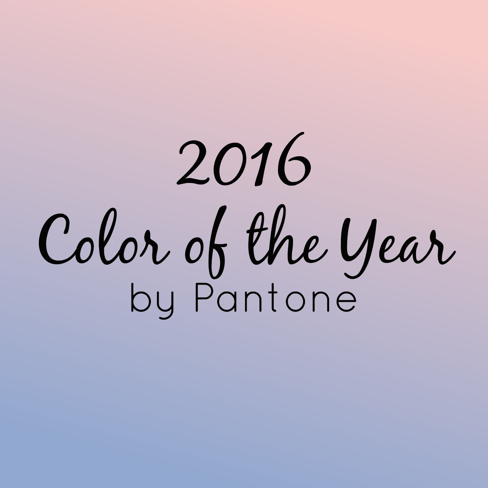
First of all I am going to talk about why this is a big deal! Pantone is basically the king of color. They create new shades and set the standard (and names) for all color shades (not just the basics). They choose a color every year that they predict will be infused into our culture and fashion, and they are always right on point! 2015 had the color Marsala, and I saw it EVERYWHERE! Deeper rust jeans and a rusty burgundy lip was all over the runways and hallways this last year. However this year is different, and special. For the first time ever, Pantone has announced 2 colors as the color of the year!
“Joined together, Rose Quartz and Serenity demonstrate an inherent balance between a warmer embracing rose tone and the cooler tranquil blue, reflecting connection and wellness as well as a soothing sense of order and peace.”
Another factor that Pantone pointed out is the importance of supporting the Gender Equality efforts made in the United States and the world this past year, that will only get stronger next year. As gender fluidity becomes more popular, apparent and visible it is important to make all genders feel included and welcome in the color of the year choices. Pantone says on their website:
“This more unilateral approach to color is coinciding with societal movements toward gender equality and fluidity, the consumer’s increased comfort with using color as a form of expression, a generation that has less concern about being typecast or judged and an open exchange of digital information that has opened our eyes to different approaches to color usage.”
They also said that they derived a lot of inspiration from different words and things that they find calming and relaxing. For example the sky and the air, as well as words like peace, wellness, and balance. Whether you hate it or love it, it is coming! I will probably stick to black clothing (as that is my M.O.) but I am stoked to see these shades dominate the runways with some romantic and airy garments to match! I am also excited to see how these two tones play out in more structured and bold designs! What do you think?